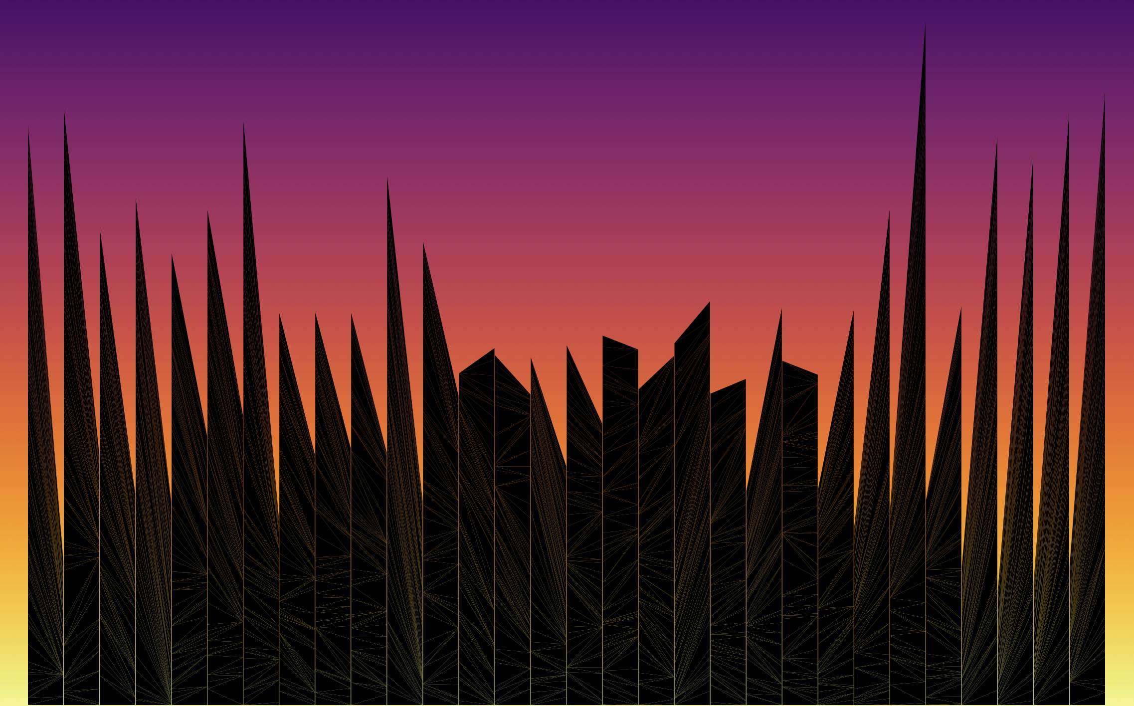
During the 2022 Winter Olympic Games I saw this tweet, https://twitter.com/szucsi/status/1494372259259199506, from Krisztina Szűcs in which she uses triangles to visualize the scores of ice hockey games. This cool graphic inspired me to create an NBA "skyline" in which I translated running team point differentials into a "skyscraper" version of the 2021-22 regular season.
Skyscrapers consisted of a series of stacked triangles, with every triangle representing one regular season game. Vertex positions were determined using the point differential from their corresponding game. When a team won, the triangle's base was placed on the left hand side with a length equal to the number of points they scored over their competition. Losses had their base placed on the right hand side with a length equal to the number of points by which the team was outscored. The overall season point differential is then visualized in the height difference between the left and right sides of the tower.
This process is demonstrated on the right with Cleveland's first five games. The Cavs lost each of their first two outings by eleven points corresponding to the two golden triangles. They proceeded to win their next three games by six, twelve and thirteen, generating the three wine-colored triangles. What results is a partial season tower with a height difference of +9 between the left and right sides. Triangles in this example are slightly separated to highlight distinct games.
My 2021-22 NBA Skyline plot can be found below, with team skyscrapers being arranged from left to right according to their league standing at the end of the regular season. Hovering over any building will highlight the triangle you are on and display the corresponding game information in the upper left hand corner of the plot. "Running Point Differential" refers to the differential up to and including the highlighted game.
